
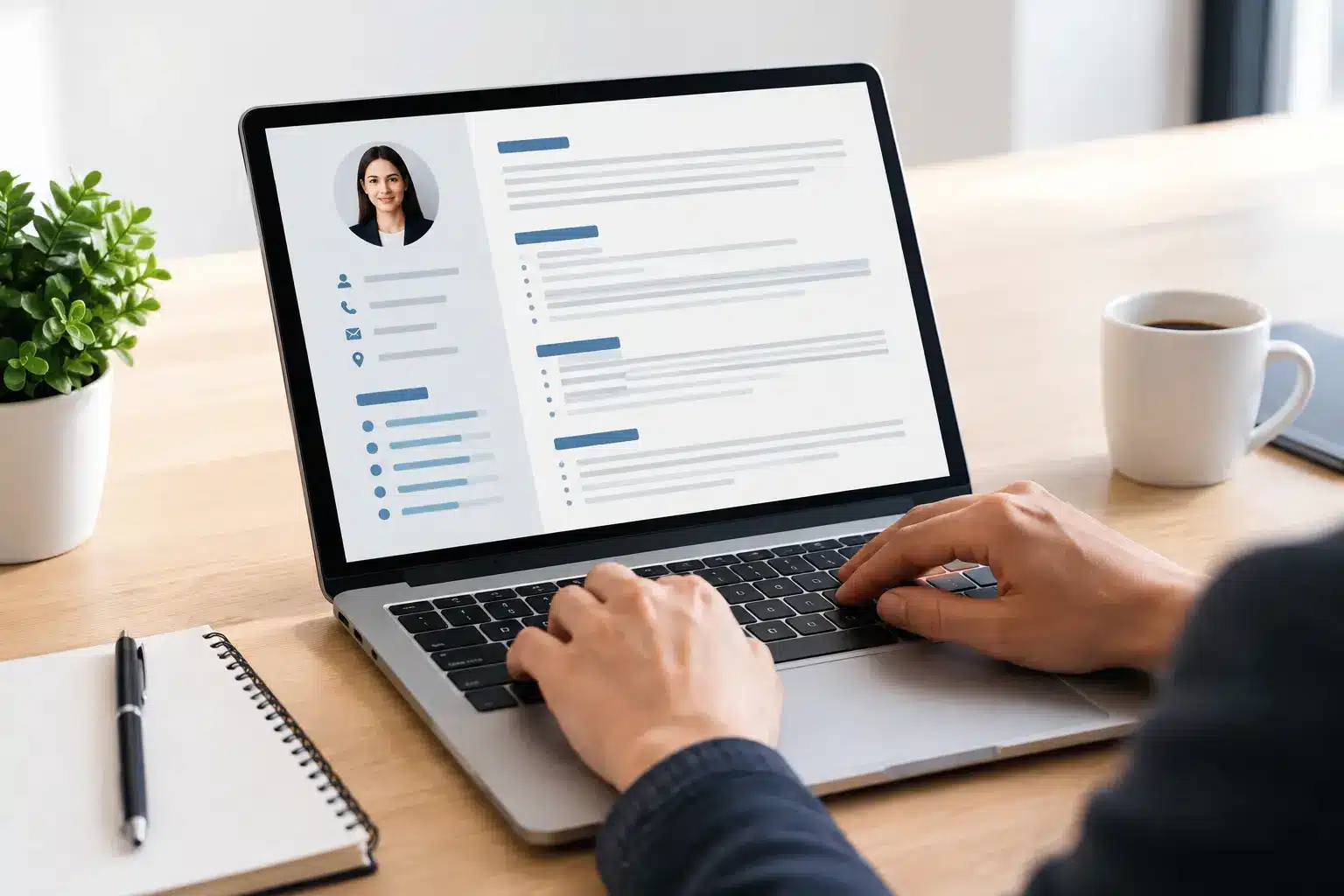

A recruiter may spend only seconds deciding whether to keep reading, but an applicant tracking system has to read your resume first. That is why choosing the best resume fonts ATS can handle is more than a design choice. The right font keeps your experience legible, preserves your formatting after upload, and helps ensure the skills you worked hard to earn are not buried by a file-reading issue.
Font choice will not replace relevant experience, strong keywords, or a tailored application. But it removes a preventable obstacle. A clean, conventional typeface lets the system extract your information accurately and lets the hiring manager scan it without effort.
What Makes a Resume Font ATS-Friendly?
Most modern applicant tracking systems do not reject a resume simply because it uses a particular common font. They extract text from your document, identify sections, and organize details such as job titles, employers, dates, skills, and education. Problems arise when decorative fonts, unusual character sets, image-based text, or complicated formatting make that extraction less reliable.
The best resume fonts for ATS share a few practical qualities: they are widely installed, easy to read at small sizes, and clear when converted between Word documents and PDFs. They also distinguish similar characters well. For example, a reader should be able to tell the difference between a capital I, lowercase l, and the number 1 without stopping.
Your file type matters too. A standard DOCX file is often the safest choice when an employer does not specify a format. A text-based PDF can also work well, especially when it retains selectable text. Avoid submitting a scanned resume PDF, because the content is effectively an image unless the system can perform optical character recognition.
The Best Resume Fonts ATS Can Read Reliably
There is no single magic font that guarantees an interview. Still, the fonts below are dependable choices for job seekers who want a professional appearance and broad compatibility.
Arial
Arial is a familiar sans-serif font that performs well across devices, operating systems, and resume platforms. Its clean shapes make it a practical option for nearly every field, from operations and customer support to technology and finance.
Use Arial if you want a straightforward resume with little risk of visual surprises. At 10.5 to 12 points, it stays compact enough for a one-page resume while remaining easy to scan. Its main trade-off is that it can look generic, so strong spacing and clear section headings matter.
Calibri
Calibri was the default Microsoft Office font for many years, which makes it a comfortable choice for recruiters and ATS workflows. It is modern, readable, and efficient in tight layouts. Calibri is particularly useful when you need to fit meaningful detail without shrinking your text too far.
For most resumes, 11 or 12 points works well. Because Calibri has relatively narrow letterforms, review the final document carefully. A resume that looks polished on your screen should still feel open and readable when printed or viewed on a laptop.
Aptos
Aptos is Microsoft Office’s newer default font and a strong option for current job applications. It has a clean, contemporary feel without looking overly stylized. It is well suited to candidates in business, tech, marketing, and professional services who want a modern document that still feels conventional.
Aptos may not appear on every older device, so save a PDF version and inspect it before submitting if the application allows PDFs. When an employer asks for a Word file, use a common default style and avoid relying on special formatting to create your layout.
Helvetica
Helvetica is a polished sans-serif font with a crisp, professional appearance. It is popular in design-conscious industries, but it is also readable enough for general applications. If you work in marketing, product, communications, or creative operations, Helvetica can offer a subtle visual upgrade over more standard defaults.
The consideration is availability. Helvetica is common on Apple systems but not universally installed on Windows computers. A PDF can preserve its appearance, but a Word document may substitute another font on the recipient’s machine. If you need maximum consistency in a DOCX file, Arial is the lower-risk alternative.
Georgia
Georgia is a serif font designed for screen readability. Its letters remain distinct at smaller sizes, making it a smart choice for resumes that include detailed accomplishments, technical work, or longer professional summaries.
Serif fonts can feel more traditional than sans-serif options, which may suit law, education, research, administration, and certain finance roles. Keep the body text at 10.5 to 11.5 points, and use whitespace generously. Dense serif text can become visually heavy when margins are too narrow.
Cambria
Cambria offers a polished, readable serif style that works well in Word documents. It gives a resume a slightly more formal tone while maintaining clear letter shapes. Candidates applying to corporate, academic, healthcare, or government-adjacent roles often find it a strong fit.
Like any serif font, Cambria works best when the rest of the document is simple. Pair it with bold section headers, consistent dates, and standard bullets rather than adding lines, icons, or decorative elements.
Times New Roman
Times New Roman is not the most visually current option, but it is highly recognizable and broadly compatible. It can be a reasonable choice for traditional industries or situations where you need to prioritize dependable formatting above all else.
The downside is perception. Some recruiters see it as dated because it has been used so widely for decades. If you choose it, use strong content and clean spacing to keep the document from looking like a generic template. For a similar level of reliability with a fresher feel, consider Georgia or Cambria.
Fonts and Formatting That Can Create Problems
A font becomes risky when it puts style ahead of readability. Script fonts, handwritten fonts, novelty typefaces, and ultra-thin styles may look distinctive, but they can make job titles and keywords harder to scan. They also risk rendering inconsistently after you upload your file.
Icon fonts and symbols deserve extra caution. A phone icon next to your number or a location pin next to your city may not be recognized as intended. Plain labels such as “Phone,” “Email,” and “Location” are clearer for both software and people.
Do not turn section headers or contact details into images. ATS tools need selectable text. The same rule applies to skill-rating graphics, text boxes, and complex multi-column templates. A two-column resume can work in some systems, but a simple one-column layout is more reliable when you are applying through multiple employer portals.
How to Choose the Right Font for Your Resume
Start with the role, not the font trend. A software engineer, registered nurse, sales manager, and recent graduate can all use Arial, Calibri, Aptos, Georgia, or Cambria successfully. The difference comes from the clarity of the content and how closely it matches the job description.
Choose one font for the entire resume whenever possible. You can create hierarchy with size, bold text, and spacing rather than mixing typefaces. Use 10.5 to 12 points for body text, 13 to 16 points for your name, and a modest increase for section headings. Anything below 10 points may signal that you are trying to squeeze too much onto the page.
Before submitting, export the document and perform a quick quality check. Can you select and copy the text from the PDF? Do your dates, bullets, and job titles stay in the right place? Does the document still look clean at 100% zoom? These simple checks catch many issues before an employer sees the file.
Build for Parsing, Then for the Reader
An ATS-friendly resume should be easy to understand without visual tricks. Use standard headings such as Professional Experience, Education, Skills, and Certifications. Put your contact details in the main document body, not in a header or footer. Write accomplishment bullets with specific outcomes, relevant tools, and the language employers use in their job descriptions.
If you are applying frequently, save a master resume and create tailored versions for priority roles. An AI resume builder can speed up that process by helping you align skills and experience with a job description, but you should still review every version for accuracy. Automation works best when it supports your judgment instead of replacing it.
A readable font will not make an irrelevant application competitive, but it gives your strongest qualifications a fair chance to be found. Pick a proven typeface, keep the layout simple, and spend the saved time tailoring your achievements to the role you want next.